

CalEden
-
Posts
948 -
Joined
-
Last visited
Content Type
Profiles
Forums
Blogs
Events
Everything posted by CalEden
-
The photo doesn't show if there were more cones marking the lane directing traffic around the plane. The cone spacing appears to be very wide and may have given the appearance of a turn lane if one's line of vision was downward or if your Polish.
-
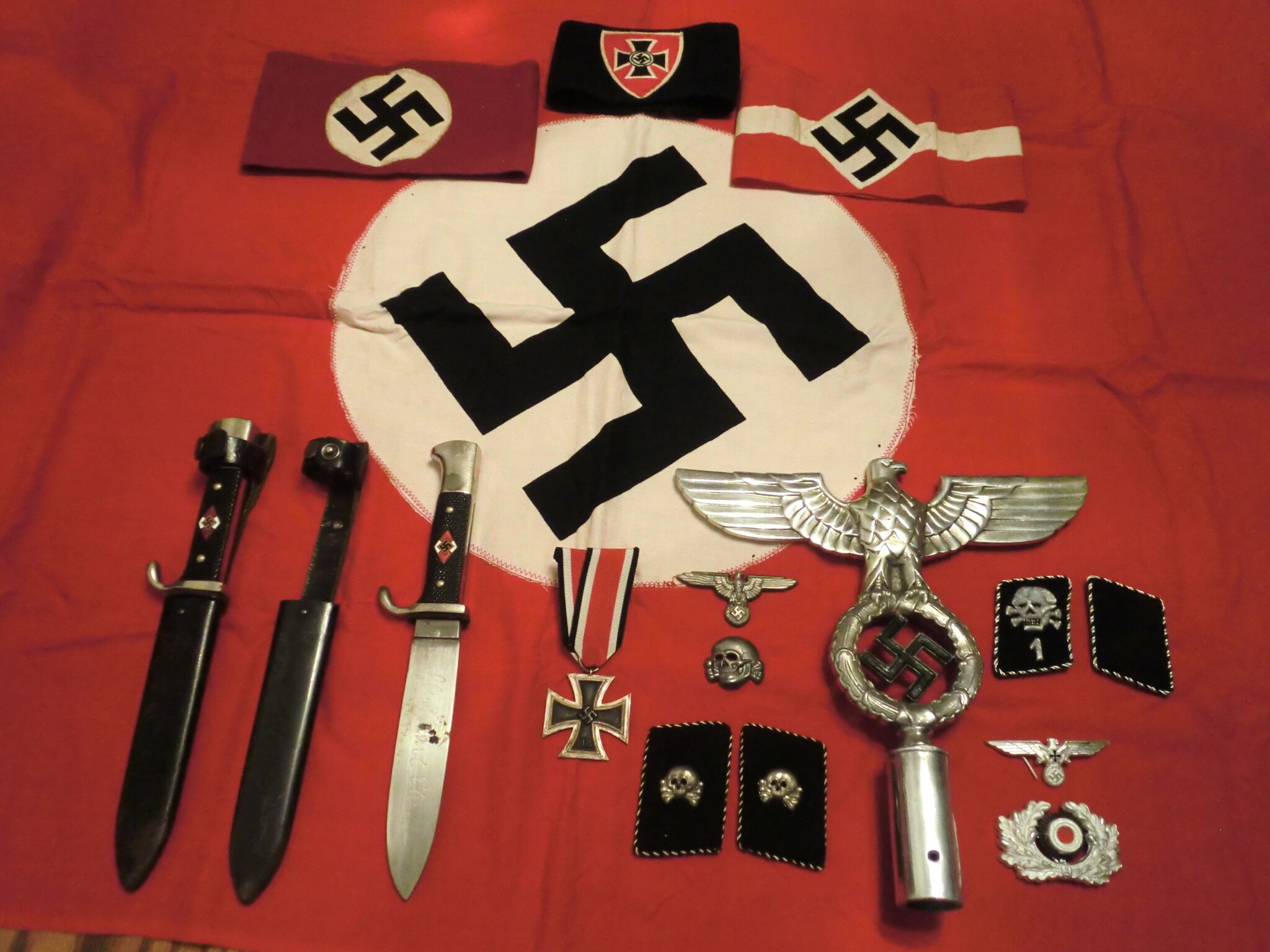
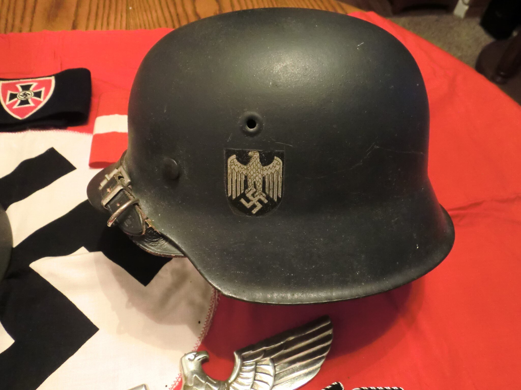
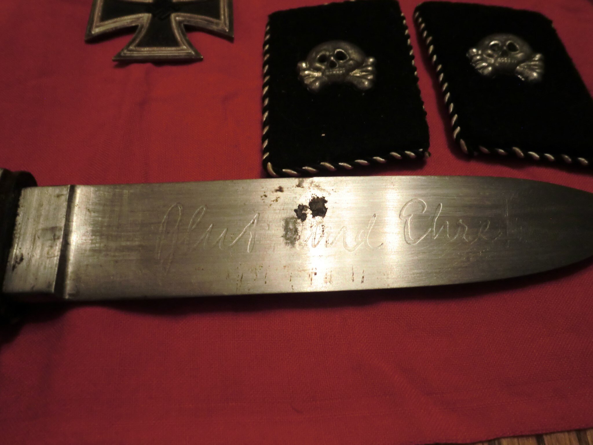
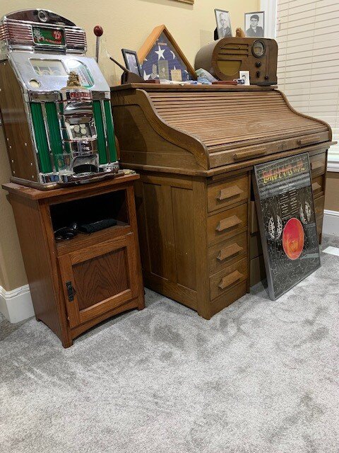
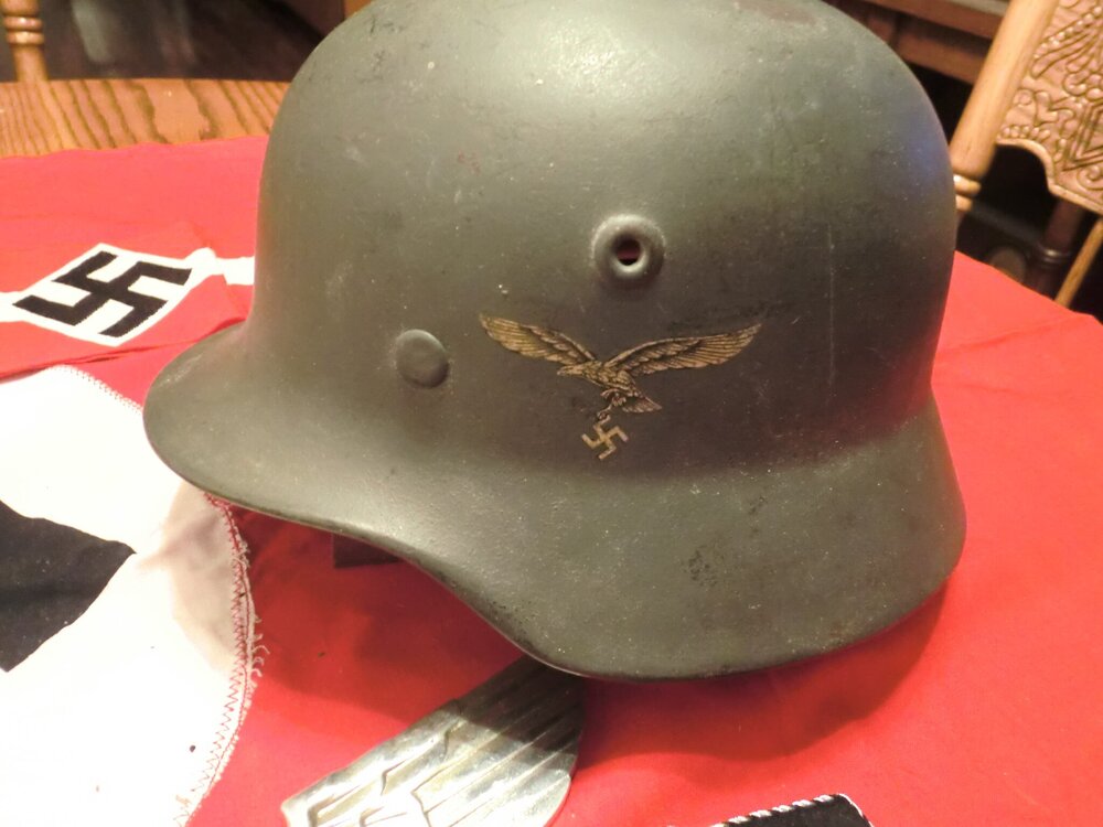
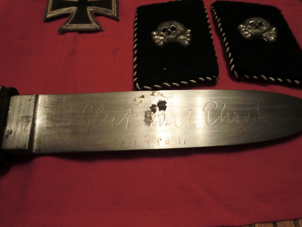
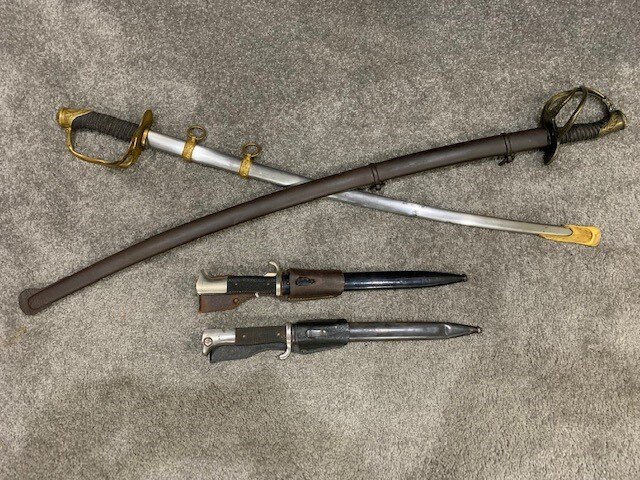
Thank you Butch, most of the collection are my Dad's War Trophies. I have a small canvas Army issued suitcase full of mainly German issued medals and uniform decorations he collected also. He was in the 8th Infantry Division (antitank unit) during WWII. My father's neighborhood friend was Don Malarkey of Band of Brothers fame. When I was young, I met Don Malarkey a couple of times. Like most of that generation that experienced the War there was no talk of the War. Don Malarkey Band of Brothers: In my collection photos on top of the rolltop desk the triangular frame with US flag contains my Dad's military dog tags, Army Photo and Army ID.
-
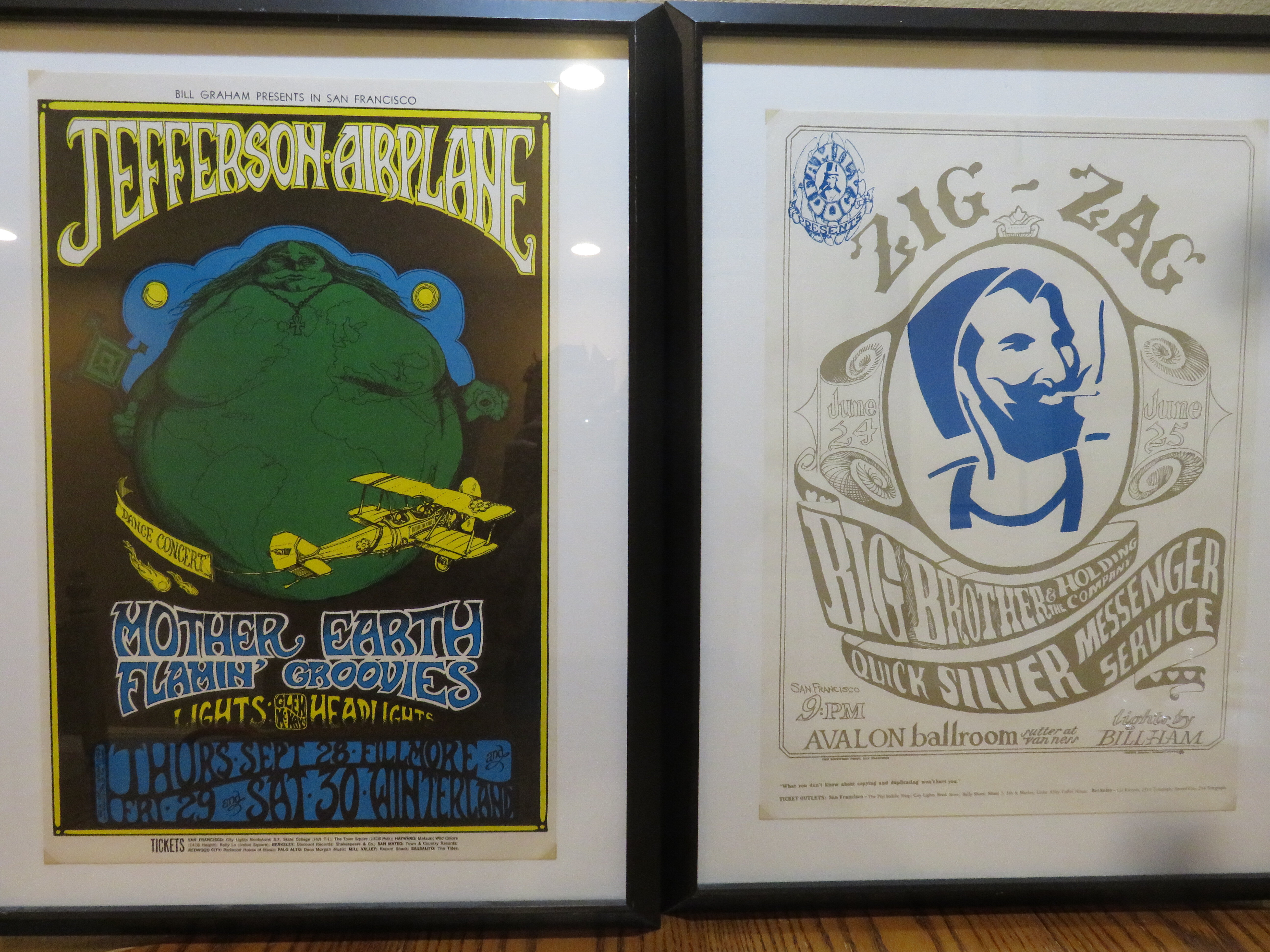
Psychedelic San Francisco, The Era, Music, Art, Scene, Hippiedom etc.
CalEden replied to CalEden's topic in Off Topic Chat
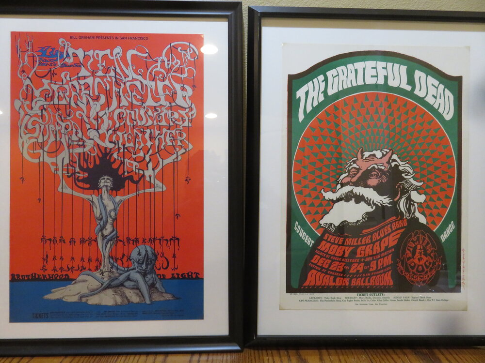
BG 099 is Bonnie Maclean's iconic poster and is a visual representation of 1967. Unfortunately, Bonnie died last year. She will be remembered for this great poster. Below is my first print of the poster.
-
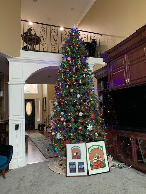
Merry Christmas Peace and Joy all over this World.

-
Buy a bigger house. Collecting is an addiction.
-
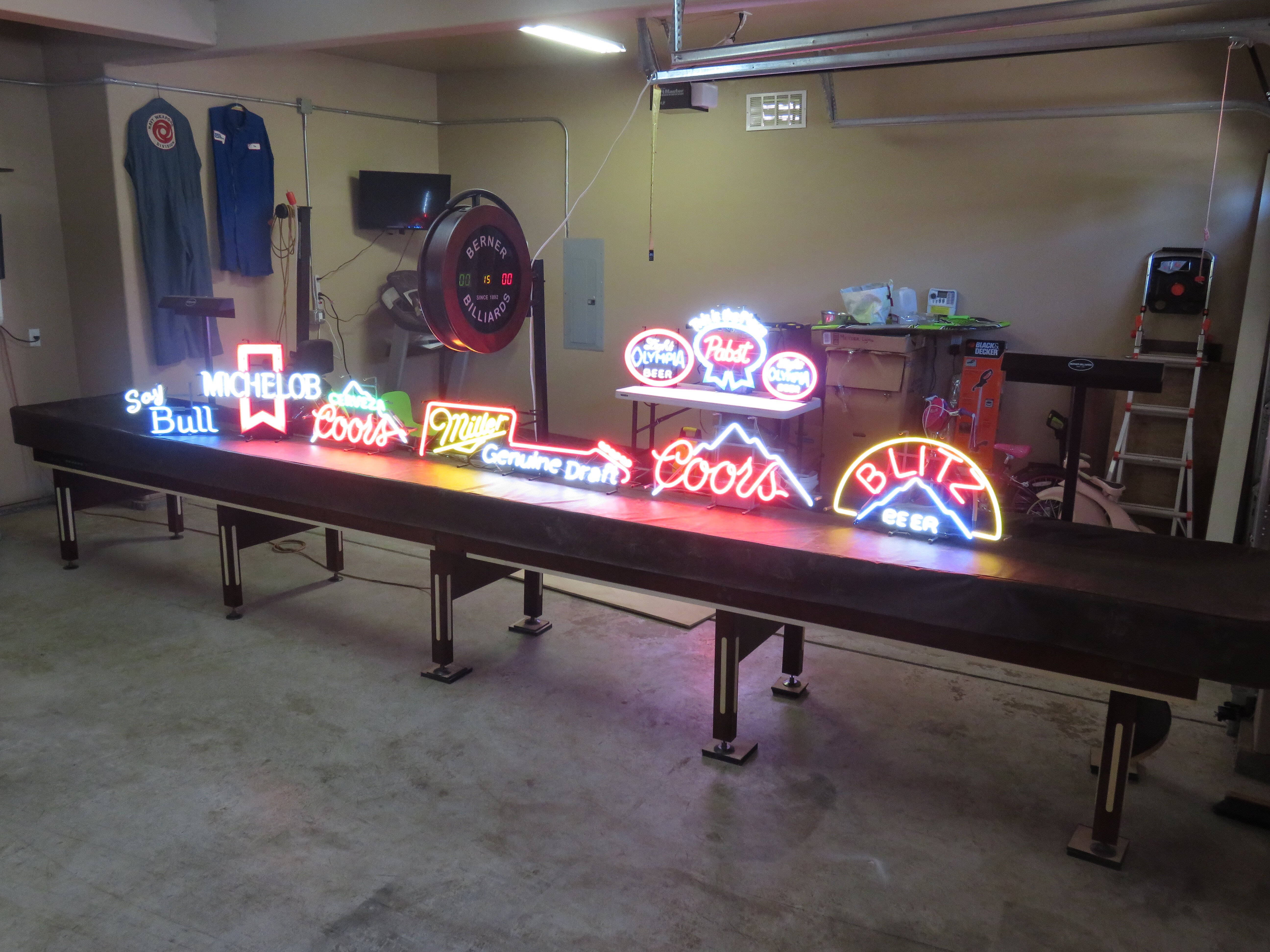
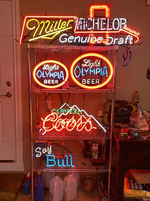
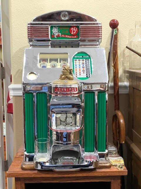
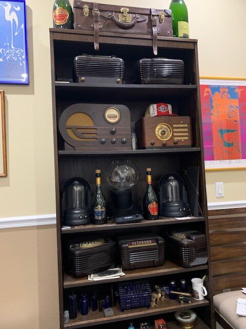
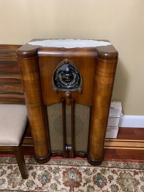
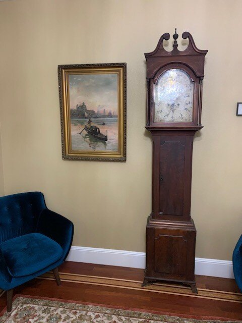
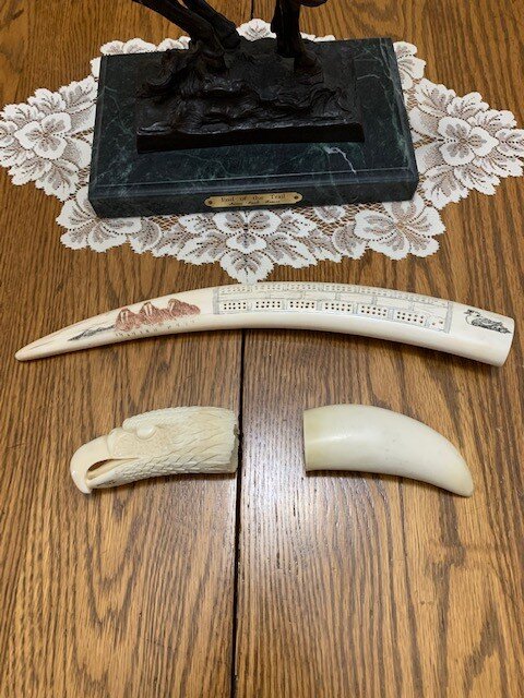
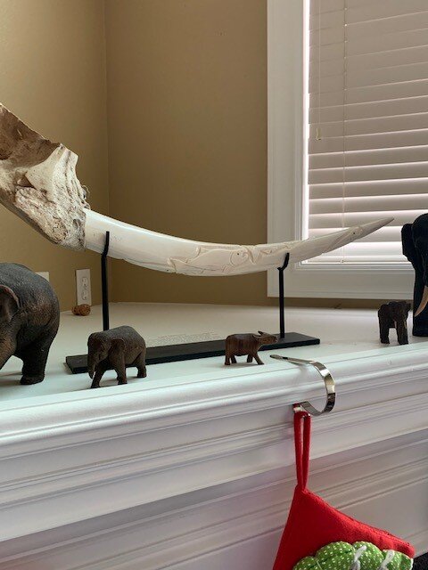
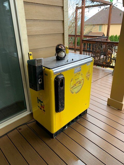
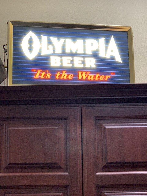
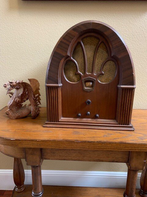
My Junk/Dust Collectors:


-
Psychedelic San Francisco, The Era, Music, Art, Scene, Hippiedom etc.
CalEden replied to CalEden's topic in Off Topic Chat
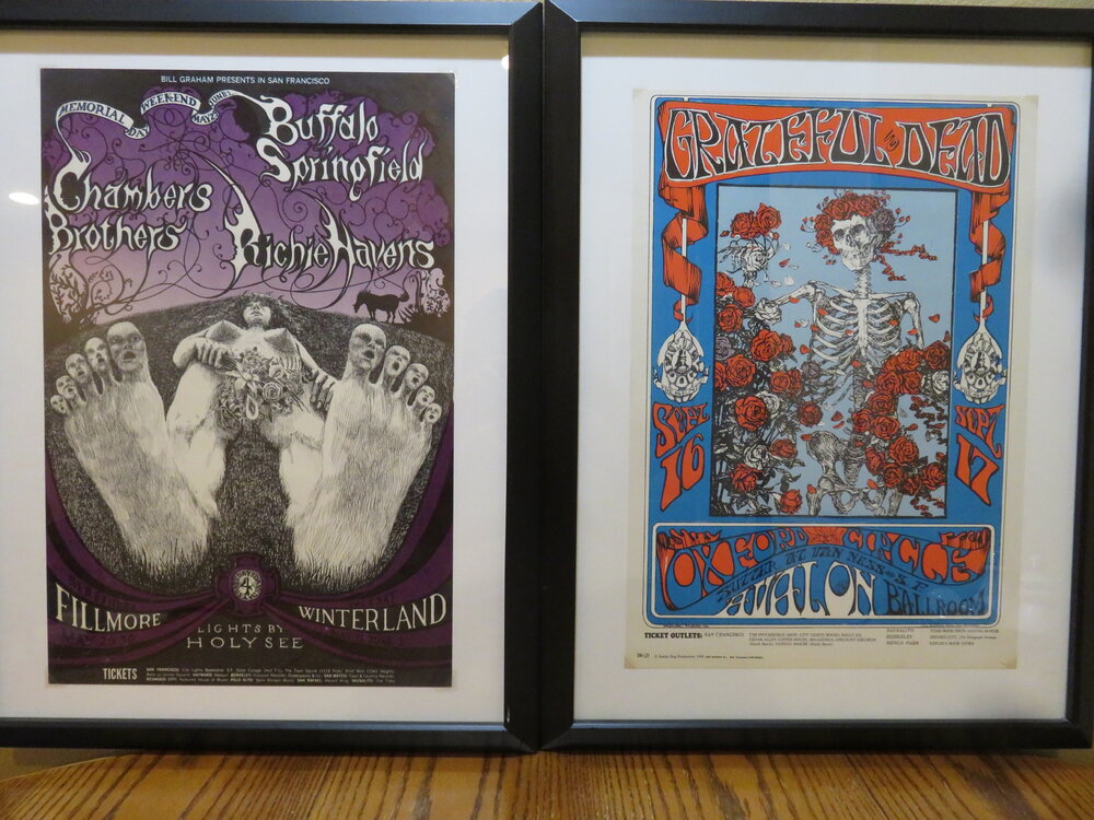
On November 14, 1984, in Bangkok, Thailand, Greg Irons was struck and killed by a bus. Poster FD080, The Tea Party, Avalon Ballroom, artist Greg Irons, Concert: South Side Sound System, Phoenix, and Freedom Highway, Sep 8-10, 1967, First Print and this was Irons first poster for The Family Dog. WIKI: "Greg Irons (September 29, 1947 – November 14, 1984) was an American poster artist, underground cartoonist, animator and tattoo artist.[1] Profile[edit] Irons was born in Philadelphia, Pennsylvania. He moved to San Francisco, California, in 1967, where he soon found work designing posters for Bill Graham at The Fillmore Auditorium. He worked on the film Yellow Submarine, then returned to work for Graham Productions. He soon branched out into album covers and "comix" work for the Print Mint, Last Gasp Eco-Funnies, and other local underground publishers. Irons' collaborations with writer Tom Veitch in the early 1970s (the creative team was known as "GI/TV") included Deviant Slice Funnies, Legion of Charlies. Other contributions to underground comics included Skull Comix and Slow Death.[2] A solo comic entitled Light Comitragies was published in June 1971 by the Print Mint. In the mid-1970s he began book illustration work, mainly for Bellerophon Books. One of these was a coloring-book format illustration of Chaucer's "The Wife of Bath's Prologue and Tale" which was issued with "The Miller's Tale" illustrated by Gilbert Shelton. In 1979, he illustrated The Official Advanced Dungeons & Dragons Coloring Album which was both a coloring book and a short adventure module authored by Gary Gygax.[3] It was also around this time he began doing tattooing. On November 14, 1984, while on a working vacation in Bangkok, Thailand, Irons was struck and killed by a bus. The August 1985 issue of Swamp Thing, vol. 2, issue 39, written by Alan Moore, is dedicated to Greg Irons.[4]" "The central image is an adult version of the Tea Party from Alice in Wonderland with all the characters smoking marijuana, the smoke is drifting upward to form the lettering. Among the characters at the Tea Party are a large breasted nun wearing a low cut habit, a monkey wearing a priest's collar and man wearing the two spades. They are sitting on toadstools. The Alice in Wonderland story with its frequent distortions of reality following ingestion of unknown substances was perfect for adaptation to psychedelic poster art and music." RIP Greg Irons victim of Bangkok Bus.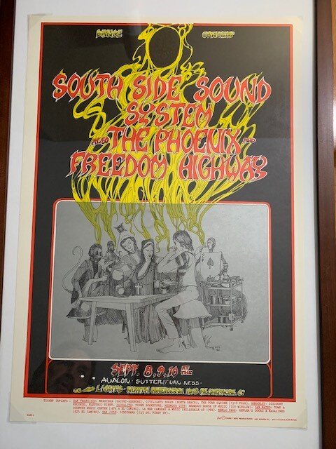
-
The War Department makes her Som Tom in the USA out same brown bowl Baby Mama's using to mix her Som Tom.
-
Great looking petite Lady! She's got that Isarn nose, that you see a lot of in the Buriram region.
-
I've gone to eight Neil Young concerts, he's the best with Crazy Horse! Pure psychedelic nirvana!
-
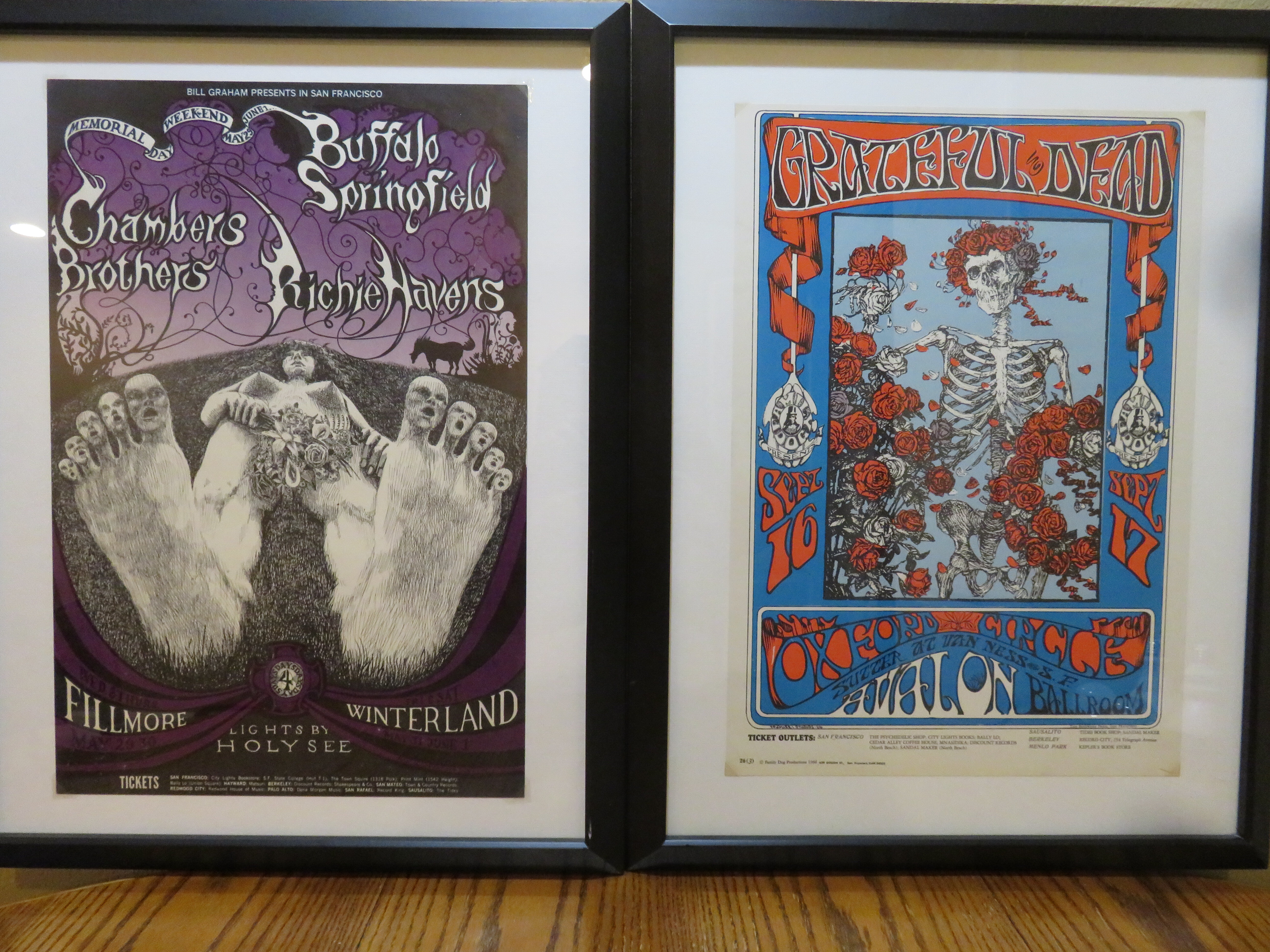
Psychedelic San Francisco, The Era, Music, Art, Scene, Hippiedom etc.
CalEden replied to CalEden's topic in Off Topic Chat
The restored olde time trolleys are really cool! -
Psychedelic San Francisco, The Era, Music, Art, Scene, Hippiedom etc.
CalEden replied to CalEden's topic in Off Topic Chat
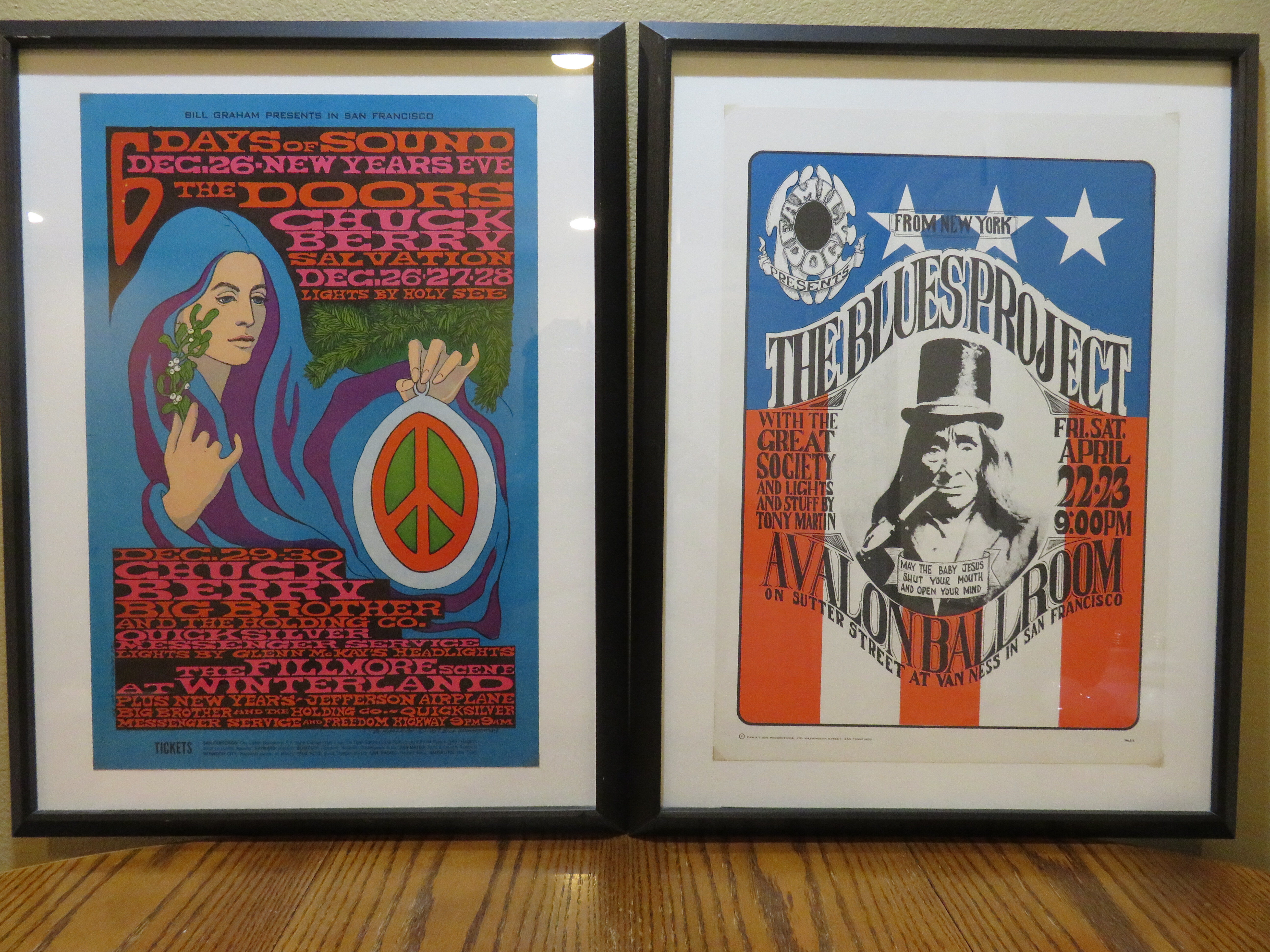
Here's another poster I passed up on because it was not a Family Dog or Bill Graham poster. Again, it is a Victor Moscoso Neon Rose poster, #5. The concert was on Feb. 6, 7, 8, 9, 11, 12, 1967 at the Matrix, featuring Sopwith Camel, an early Psychedelic band and minors were welcome. As you can see, I'm in the process of framing it when the photograph was taken.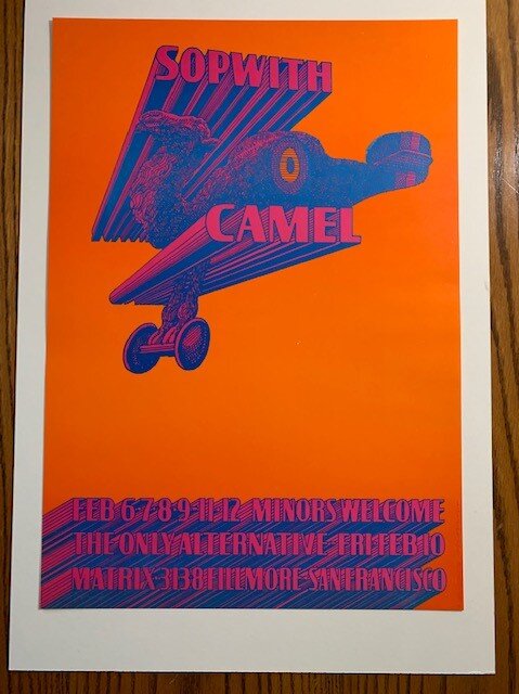
-
Laurel & Hardy "March of the Wooden Soldiers" Love the Zepplin flying crazy monkey throwing the cherry bombs scene. Also, the Bogey Man chase scene. Just silly comedy! "It's a Wonderful Life" The original Martini's Bar looks like a wonderful place to have a drink! "Christmas Story" I think the Lamp would be great in my den. "Christmas Vacation" 4 years ago fell off the ladder when one side sunk into the wet ground when stringing the lights on the roof ledge.
-
More craziness!
-
Crazy double post. See post below!
-
Psychedelic San Francisco, The Era, Music, Art, Scene, Hippiedom etc.
CalEden replied to CalEden's topic in Off Topic Chat
FD-85 Dian Poster, Artist Alton Kelly, Avalon Ballroom Sep 26 thru Oct 1, 1967, Vanilla Fudge and Charles Lloyd Quartet: "The central image is a woman wearing a diaphanous gown. The woman in this photograph, Josephine Marcus, was the wife of Wyatt Earp, the famous Old West lawman who later worked in San Francisco as a newspaper reporter and lived well into the 20th-century. This photograph of Josephine Marcus has such a modern feeling to it that many people have mistaken it for a contemporary photograph".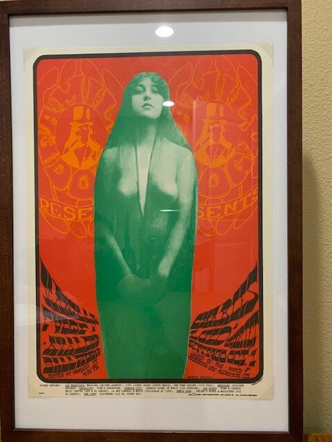
-
Psychedelic San Francisco, The Era, Music, Art, Scene, Hippiedom etc.
CalEden replied to CalEden's topic in Off Topic Chat
My primary poster collecting emphasis was to acquire as many 60's Bill Graham and Family Dog Posters as I could. So early on I passed on many cool posters. I just acquired one such poster but because of the heavy demand it wasn't cheap. Neon Rose is a Poster Series by Spanish born poster artist Victor Moscoso. Neon Rose #12: I've seen this poster used as avatar on some of the boards. This poster promoted The Chamber Brothers at the Matrix. "The Matrix was a nightclub in San Francisco from 1965 to 1972 and was one of the keys to what eventually became known as the "San Francisco Sound" in rock music.[1] Located at 3138 Fillmore Street, in a 100-capacity beer-and-pizza shop,[1][2][3] The Matrix opened 13 August 1965, showcasing Jefferson Airplane, which singer Marty Balin had put together as the club's "house band". Balin had persuaded three limited partners to put up $3,000 apiece to finance the club's opening, giving them 75 percent ownership, while he retained 25 percent for creating and managing it.[4]" " Victor Moscoso Victor Moscoso was the first of San Francisco’s “Big Five” psychedelic poster artists to have his work shown in the Museum of Modern Art in New York. Moscoso pioneered the use of vibrating colors to create the ‘psychedelic’ effect in poster art. His work is in the Victoria and Albert Museum in London and in the Library of Congress. His Neon Rose series of posters is one of the crown jewels of the psychedelic poster era. Born in Spain in 1936, Victor Moscoso was brought up in Brooklyn, New York, where he studied art at Cooper Union Art School before attending Yale University School of Art. At Yale, he studied with the modern colorist Joseph Albers, whose color theories were an important influence on Moscoso and on the development of the psychedelic poster. Moscoso moved west in1959 to attend the San Francisco Art Institute, where he later received his MFA. After graduation, he remained at the Art Institute, where he taught lithography and built a career as a freelance graphic designer. Moscoso’s interest in psychedelic poster art was sparked when he saw Wes Wilson's Paul Butterfield poster (FD-3) for the Family Dog. As Moscoso recalls in an interview, “Stanley Mouse and Alton Kelley's poster for "Zig Zag," [“Zig Zag Man (FD-14)] influenced me . . . I mean when I saw Mouse and Kelley do “Zig Zag,” it just about knocked me down on the sidewalk . . .” Moscoso became active doing concert posters in the fall of 1966 with work for the Family Dog at the Avalon Ballroom. His Neon Rose posters for The Matrix brought his work international attention in the Summer of Love 1967. As of 1967, Victor Moscoso had gone through a transformation; he had to set aside his academic training and has said, “One of the ways that I did it was by reversing all the rules I ever learned in school . . . For instance, I had been told that lettering should always be legible, so I turned that around to say: Lettering should be as illegible as possible. Another rule was that a poster should transmit its message quickly and simply. So, I said: A poster should hang you up as long as possible. Another one is: Do not use vibrating colors; they're irritating to the eyes. So I said: Use vibrating colors as much as possible. After all, the musicians were turning up their amplifiers to the point where they were blowing out your eardrums. I did the equivalent with the eyeballs . . .” “So I reversed everything that I had learned, and once I did that, then it fell into place. Then everything I’d learned in school began to work for me. I could pick a vibrating color like nobody could . . . It's not just using colors from the opposite of the color wheel. The intensity has to be equal. The value has to be equal, so that your eye cannot tell which one is in front of the other . . . Your eyes are limited. That’s why you can see motion pictures. Motion pictures don't move. They're just a lot of still pictures. However, because of the limitations of our eyes, they appear to move . . .” Moscoso tells about watching people cross the street to look at his posters on telephone poles: “I would just stand out on the street, like outside the Trieste, and I could even stay inside the Trieste and watch people as they passed. One of the reasons I used vibrating colors is because it's kind of like neon lights flashing. The other thing that catches your eye is contrast. Stop: Black and yellow. But you can read that from across the sidewalk and continue. The neon . . . the vibrating colors will catch your attention and then "what's going on?" brings you over. The other thing that hangs you up is complexity. Make them complex. A poster should not transmit its message quickly and simply. They'll be gone man. I wanna see if they could stay there an hour. I wanna see if they can stay there a whole week . . . “. . . That was advertising. The only way that those events were advertised was by those posters, which we made as hard to read . . . I made as hard to read as possible. And it worked. The halls got filled up, because of those posters. They started getting torn off the wall. Then you could buy them for a dollar. They go up at the Trieste and catty-corner from the Trieste was Ben Friedman's poster shop. They'd be in Ben Friedman's for a dollar. So, here's advertising coming at you from both sides of the corner . . . when they started getting sold for a dollar, hey, I took art history. I know that when the Toulouse Lautrec and Jules Cheret posters started getting ripped off the walls, that's when the poster stores opened. For lo and behold, I said to myself, this is what happened in Toulouse Lautrec's day. If it happened in Toulouse Lautrec's day and it looks like it's happening now, well, then it's happening now. All I wanted to do was invent posters. Not free posters, not white rabbit posters, not East Totem West posters. I didn't want to do those. I wanted to, I guess because of the historical value, I somehow intuited that these were events, historical events, with dates, and that's all I wanted to do . . .” “And I didn't want to be dependent on Bill Graham, Chet Helms, or anybody else at that point. I said, "Okay, I'll set up my own company," and I went to The Matrix because The Matrix was playing The Doors, Big Brother & The Holding Company—the same groups that were at the Avalon Ballroom and at the Fillmore, and I said to the guy at The Matrix ‘How would you guys like to have me do some posters for you? Already, I've been doing posters at the Avalon. They already were good.’ And they said, "Sure, we'd love it, but we don't have the money. We can't afford it." I said, "No problem. I will give you 200 free posters for your event. I will pay for them and I'll run off as many as I can afford and sell them.’ Sure. Well, here they're getting 200 free posters, one of the top poster artists at that time. So I commissioned the poster, I designed the poster, I produced the poster, and I sold the poster. I was selling posters to Australia, the other side of the world.” In 1968, Moscoso became a leading artist for the underground comics. He and his friend and colleague, Rick Griffin, were two of the main contributors to Robert Crumb's legendary Zap Comix. While working in comics, Moscoso designed magazine cover art, billboards, and album covers for Jerry Garcia, Bob Weir, and Herbie Handcock, among others."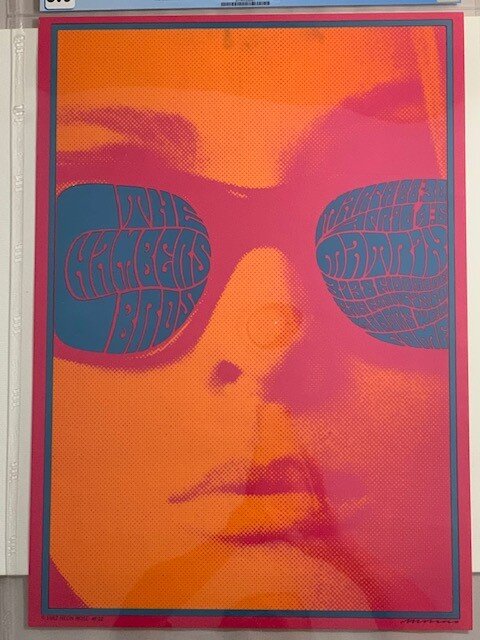
-
Psychedelic San Francisco, The Era, Music, Art, Scene, Hippiedom etc.
CalEden replied to CalEden's topic in Off Topic Chat
A poster dealer I buy from gives a 20% discount the first half of December. Shopping his inventory, I noticed a number of Grade 10 Posters, all mostly Lee Conklin. I realized I don't have a grade 10 poster in my collection of thirty graded posters. The "Blues Bash "was a group of shows that featured Electric Flag, Buddy Guy, Freddy King, Blue Cheer, and Ike & Tina Turner at The Fillmore in July 1968. The great Lee Conklin design has a pair of fighting creatures with horns forming the words "Blues Bash." The Poster BG128 is a first print poster signed by Lee Conklin: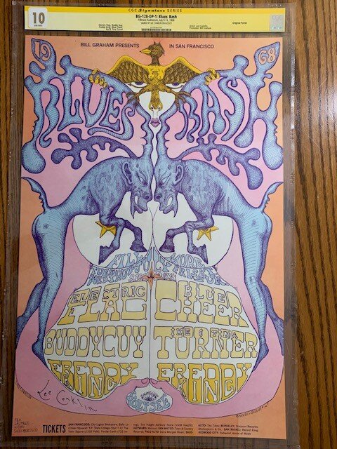
-
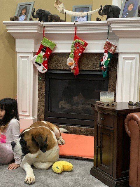
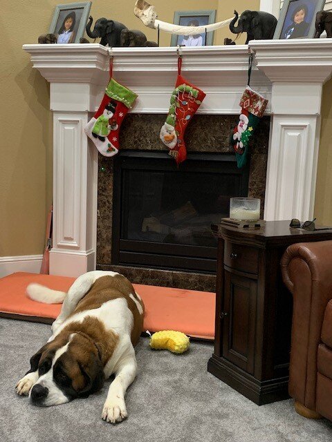
The trees up, the Budda Shrine on round table upper left and Satanic Santa is under the tree that about covers it at the Eden House: Get it up and Enjoy the Holidays!

-
Psychedelic San Francisco, The Era, Music, Art, Scene, Hippiedom etc.
CalEden replied to CalEden's topic in Off Topic Chat
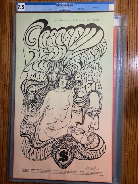
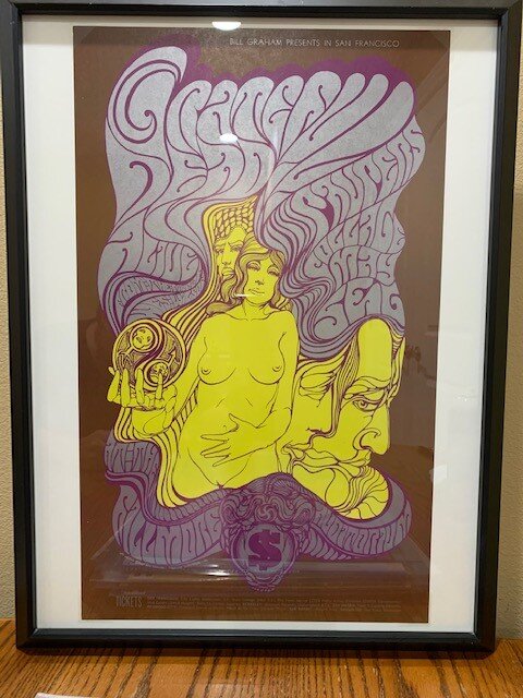
The second most prolific artist was Wes Wilson at 56 Bill Graham posters. Wes Wison was noted for his psychedelic style of lettering. He utilized his wife as a model for his female nudes. BG062 was Wes Wilson's last Bill Graham Poster. Bill Graham and Wes could not mutually agree in the final compensation for BG062. Graham stubbornly stood his ground on the final compensation. Wes Wilson not happy, included a viper at the bottom of the poster that included the lettering Filmore Auditorium in the snake's body and between the fangs a dollar sign as an attack on greedy capitalist aka Bill Graham. The Concert performers were Grateful Dead, The Paupers (ironic), Collage & Alive May 5, 1967: "This Wes Wilson creation for a 1967 Grateful Dead concert with Paupers and Collage was printed using a “split fountain” technique. The background of the original varies from green at the top to yellow to pink at the bottom. The art is printed in black ink. The reprint is completely different—it was printed in yellow, gray, and purple on a brown background. The central image is an illustration of a nude woman viewed from the hips up. Around her are several men’s faces. One of the nice touches of this poster is the yin and yang symbol in the woman’s hand. Wilson placed the arrow symbol for male and the plus-sign symbol for female inside the yin and yang, with both symbols containing faces. Many people believe that this—the last poster in this part of the series—was Wilson’s best. By this point he had thoroughly modified the Roller alphabet into his own. Not-to-be-missed is the symbology of the venomous snake with the dollar sign between its fangs." "BG062 is Wes Wilson's final Fillmore poster in his series of 56 and is a study in symbolism. Wilson's comments on the future of the counter-culture movement and his view of the predation of concert promoters are more subtle. Wilson casts a jaded eye on the avarice of the industry in general and Bill Graham in particular and brands the Fillmore banner at the bottom of the poster with a vaguely Christian symbol featuring the Almighty Dollar." Both Posters above are first print posters. It is very hard to find first rate quality BG062 Posters. Second print posters did not utilize the split fountain technique and the coloring was different from the original. 1967 seems pretty early for the shaved bush.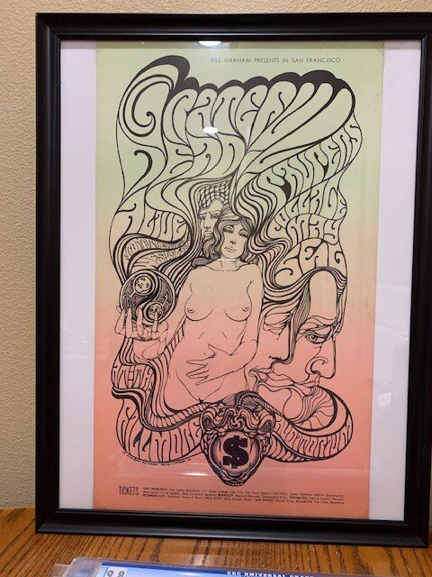
-
Psychedelic San Francisco, The Era, Music, Art, Scene, Hippiedom etc.
CalEden replied to CalEden's topic in Off Topic Chat
I've never attended a Dead Concert to listen to the music. But, several years prior to Jerry Garcia's death, when the Dead played nearby, I would attend the preconcert tailgate markets. These tailgate markets were like a time warp back to the 60's. Some great stuff for sale! -
Psychedelic San Francisco, The Era, Music, Art, Scene, Hippiedom etc.
CalEden replied to CalEden's topic in Off Topic Chat
You're a Deadhead for life! -
Psychedelic San Francisco, The Era, Music, Art, Scene, Hippiedom etc.
CalEden replied to CalEden's topic in Off Topic Chat
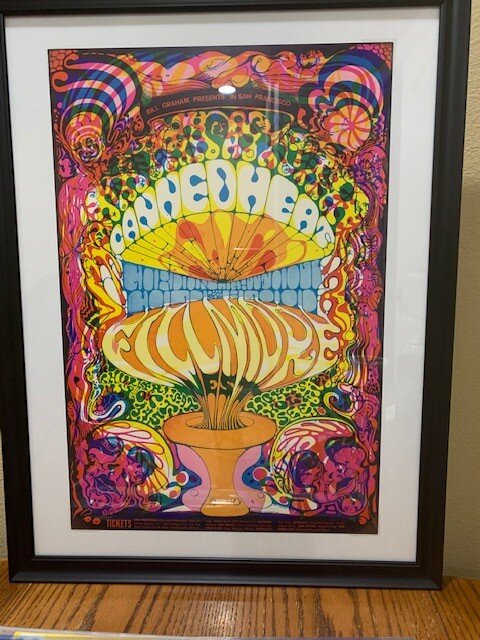
BG095: BG139 Canned Heat, Gordon Lightfoot, Cold Blood; October 3, 1968, Artist Lee Conklin printed the poster out of register to create an LSD Filter effect. BG153 Vanilla Fudge, Richie Havens, The Youngbloods, Cold Blood December 31, 1968; Artist Lee Conklin deeply inspired by the Dutch Master Hieronymus Bosch's "Garden Of Earthly Delights. The Bosch inspiration is present in many of Conklin Posters as in BG153.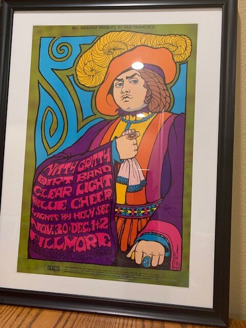
-
Psychedelic San Francisco, The Era, Music, Art, Scene, Hippiedom etc.
CalEden replied to CalEden's topic in Off Topic Chat
Man, it would be crazy if this house could tell its story! I love Victorians. Thanks Laz!